

Company Values
Company Values
A new Change Log comic plus round one of Design Principles for Comic Art!

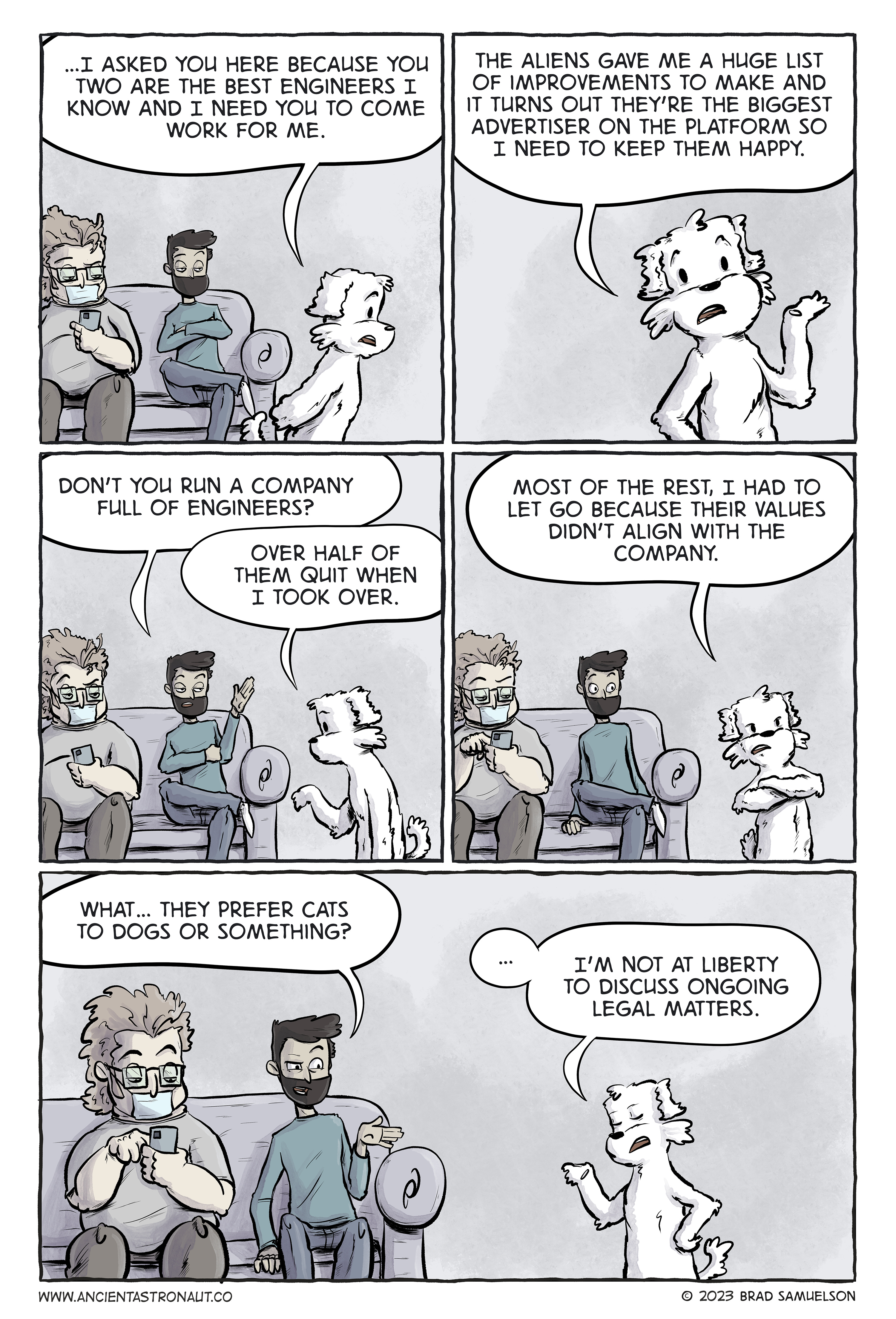
Gotta keep the customers happy. If you missed recent comics, Miles and Ollie were abducted by aliens… just go back and read about it here to catch up. So you may notice that this storyline is inspired by true events. For the record, I have no insider knowledge about what is going on at these big tech companies, but from what I do know about some of them, this isn’t outside the realm of possibilities.
Visual Storytelling for Comics - Design Principles part 1
As I mentioned last week, I’ve been thinking a lot about what makes good storytelling in comic art and one of the big issues I notice with storytelling that isn’t quite there yet is that artists don’t understand that they are actually designers as well. To help with that, I wanted to go through some design concepts from the perspective of a comic book artist.
When I was young the only thing I wanted to be when I grew up was a comic book artist. I would read any interview I could find with working comic artists trying to figure out how they got into the industry. One bit of advice that kept coming up in those interviews was to study graphic design. At the time, I didn’t understand what that meant or why it mattered.
You might be thinking, “I’m an illustrator, not a designer”. Well, my friend, I’m happy to let you know that if you are making comics, congratulations, you’re also a designer. Actually, with any visual medium (illustration, cartooning, photography, etc) you are applying design to some extent, whether you realize it or not.
Design Principles are fundamental tools, much like anatomy, proportion, and perspective are what you would think of as fundamentals in illustration. These principles, referred to as Gestalt Principles, are concepts about how humans perceive visual elements in relation to each other and the overall composition. It’s actually psychology. How we innately observe things we see in the world.
Most people don’t even realize these exist but when we understand them and use them to our advantage it elevates our storytelling. At the same time, when we ignore these principles, something just seems off about our layouts and composition.
There’s a lot to go through, so let’s get into it. Usually when you read about these principles they are explained in the context of how a graphic designer would apply them. I’m coming at this as a cartoonist/comic book artist so I’m going to explain them in that context.
Simplicity
Also known as the law of Prägnanz (which means ‘concise’ in German). Humans prefer things that are simple, clear, and ordered. When we’re presented with complex shapes we tend to break them down into simple forms we recognize and understand. The cool thing about this is that it allows us to combine recognizable objects (that’s the key) into a single silhouette that your reader will be able to interpret and understand.

In the sketch above, there are a lot of blocky shapes and something that your brain probably recognizes as a car and buildings. Those objects aren’t defined, but your brain does the work because that’s what makes sense to it.
Closure
Similar to the simplicity principle, our brain will look at an incomplete image as a whole and complete the shapes to form something it understands. A fun use for this is a character dressed in black in a dark room where you can only see bits of the figure (hand, face, highlighted edges from a light source, etc) but your mind doesn’t say “what’s that hand and head doing floating in a dark room”.
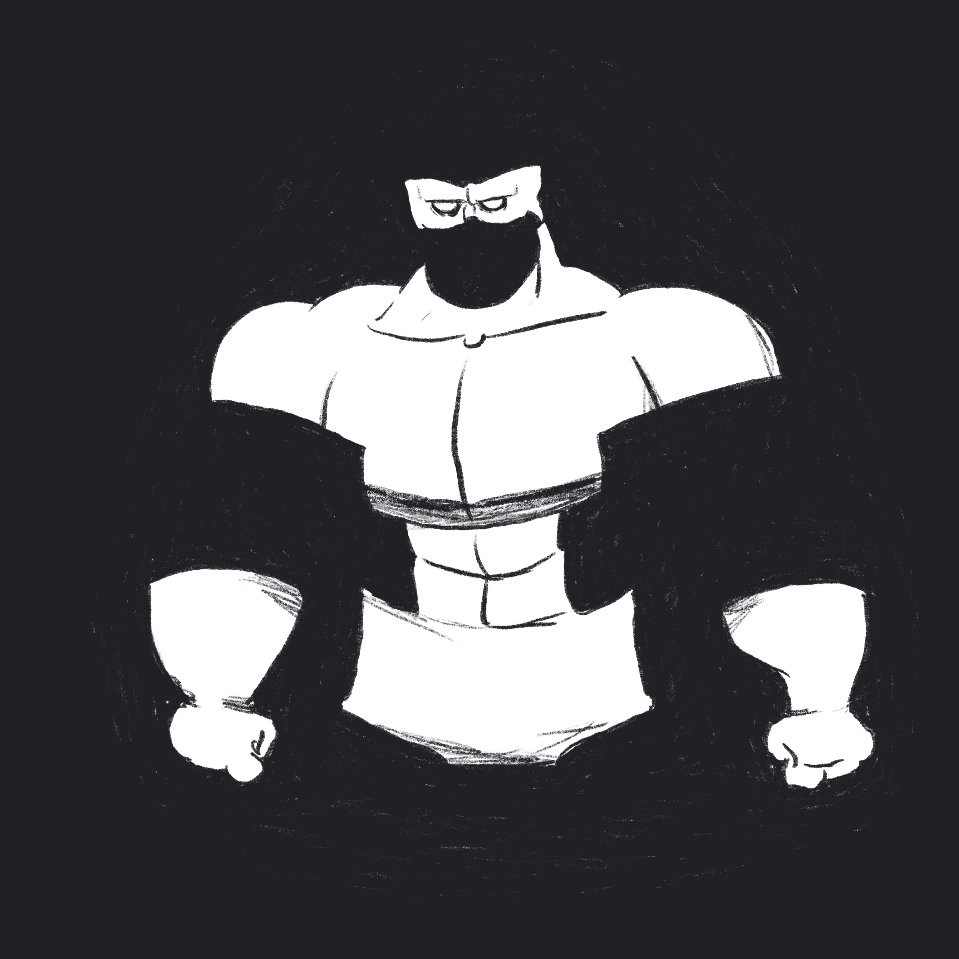
This is a quick sketch of Captain Closure. He has no arms or legs (or top of his head) but your brain doesn’t believe that so it adds them for me. Thanks brain!
Symmetry and Order
As humans, we look to find order in chaos. This makes us want a composition that has balance or symmetry. When thinking about this as a design principle, using symmetry, order, and balance can elevate a composition and provide a focal point, but it has to work in the context of the scene. Don’t force this one.

There’s a lot of chaos in this sketch, but the windows on the building provide some symmetry (symmetrical to the building, but not necessarily to the composition) and order so your brain interprets that as more of a focal point than the jumble of stuff on the rooftops.
Figure/Ground
This is one of the more obvious ones, as it relates to comic art. Humans will naturally separate a figure from the background when looking at a composition and that relationship will quickly tell them where to focus. This is often achieved through value and contrast. You also might see it represented in the level of detail (reducing the detail of a background to give the viewer the indication that it isn’t a focal point). When things are too muddled, either by color value, contrast, or level of detail, you can kill the figure/ground relationship and make the reader work to find the figure. This is bad, don’t do this.
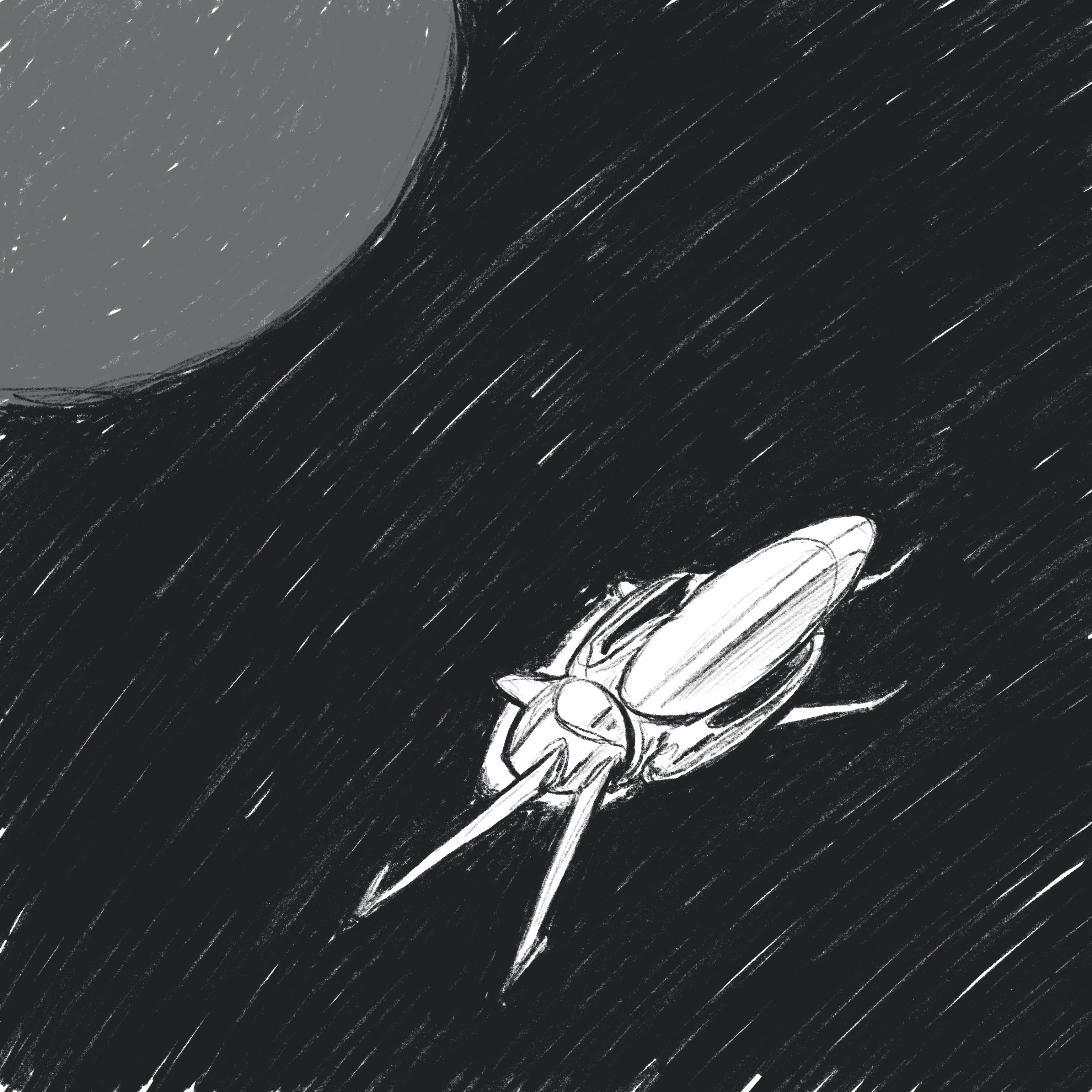
This one is fairly straightforward. The ship is obviously the figure to the space/planet background.
Visual Connection
When elements are connected with lines or other visual elements, we perceive them to be related. This one sounds obvious, but it’s something that can be done in a subtle way that doesn’t smack the audience in the face.
This example is pretty straightforward. Tying things together by lines that connect the objects.
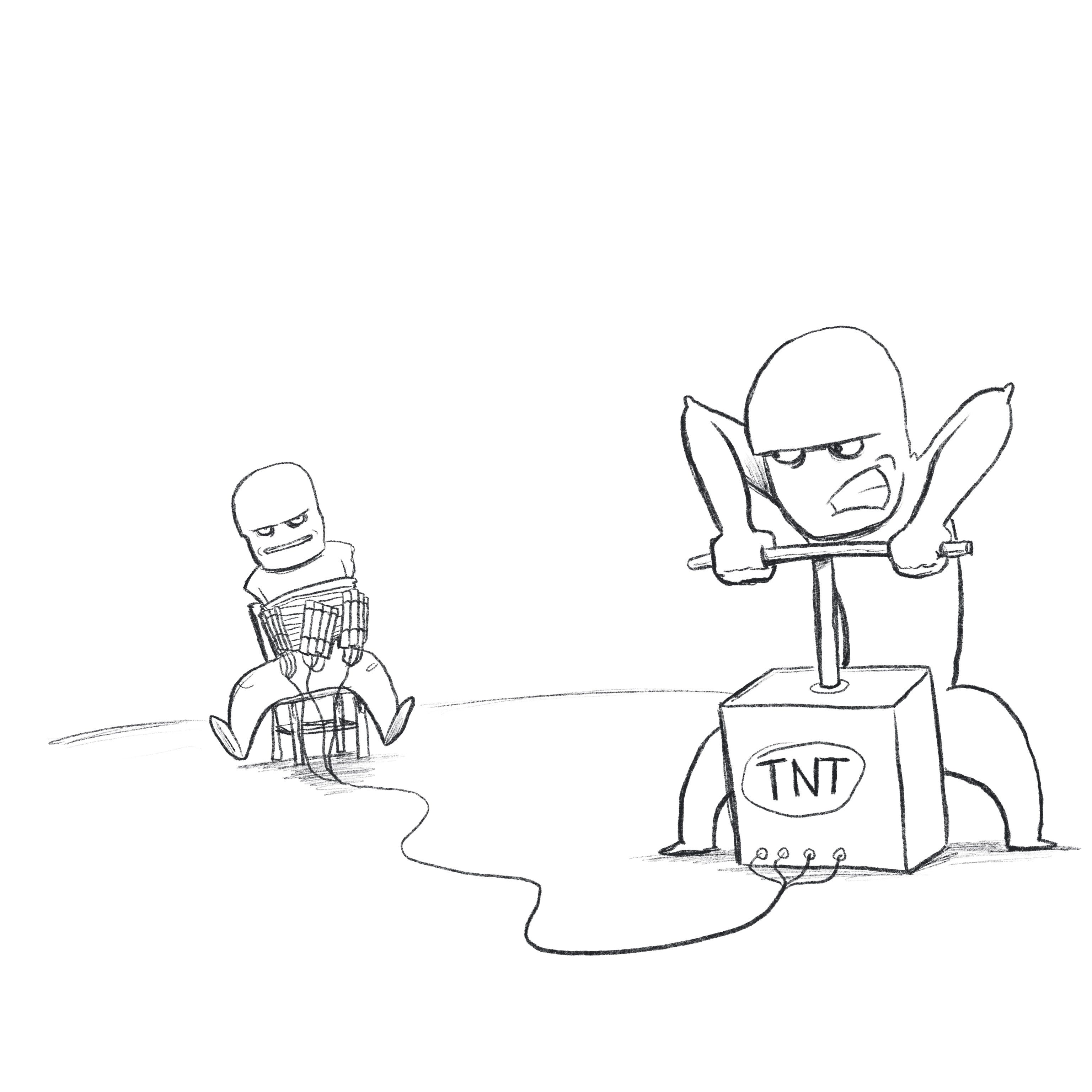
Common Regions
Another way to show items as being related is by grouping them in a common region. This can be done using negative space, contrast, or arranging elements on different colors or background settings. Again, this can seem obvious, but when used in a subtle way it can be very effective at hinting at different aspects of a story that you might not want to be overtly obvious.
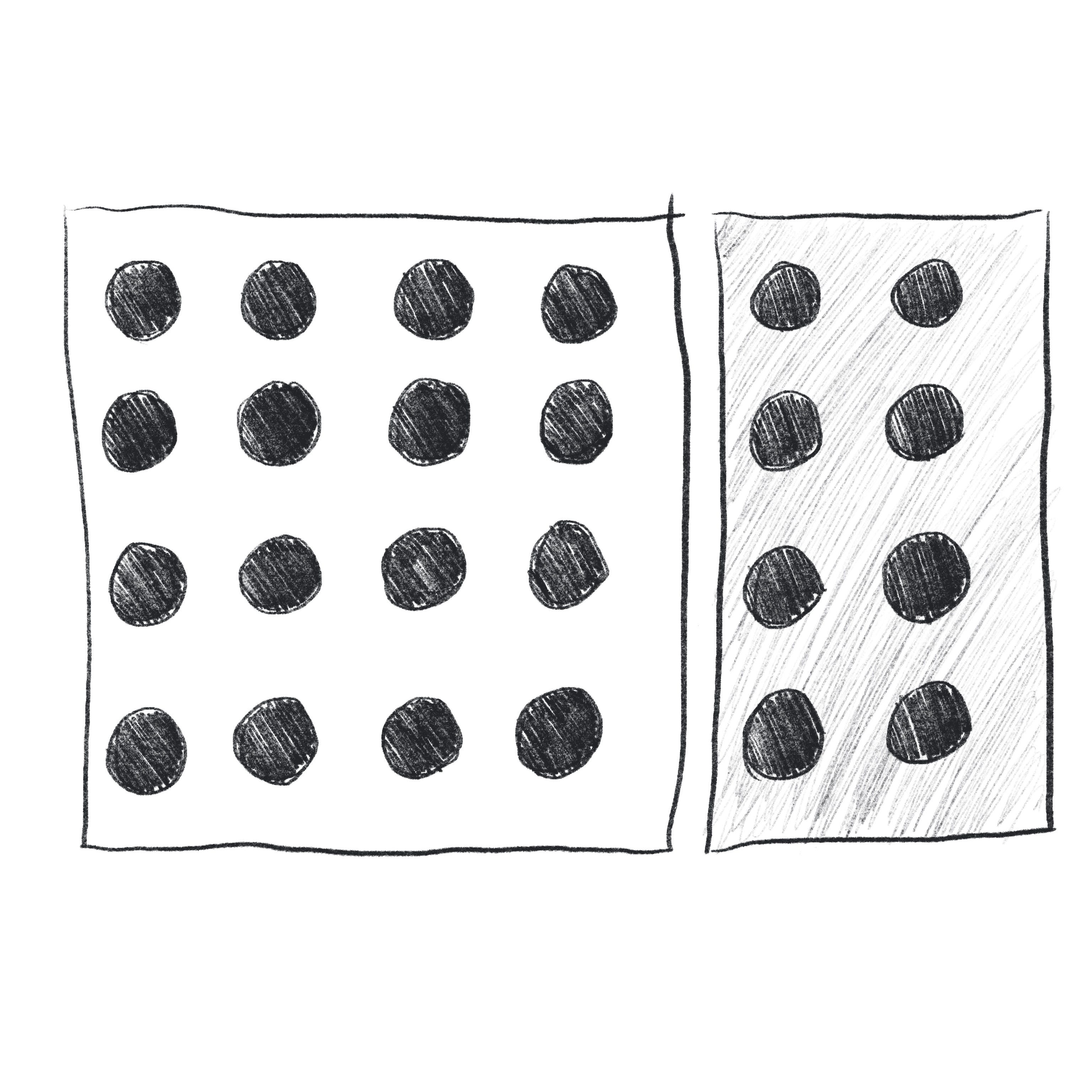
Ok, I’ll be honest, I struggled to think of an example of this that would be applicable in a comic art context but I still wanted to show what I’m talking about so I went with the standard example. I’m sure you guys out there can figure out how to apply this to your comic art in a more creative way than this.
Whew, that was a lot so far, but we’re really only half way through. Hopefully you found this helpful or interesting. If so, come back next week for round two! And if you did find it useful, please consider hitting the little heart icon and forwarding it to someone else that might also be interested. If you want to support me you can do that by buying something from my store - don’t forget to use the discount code SUBSTACK on digital items - or my old store which is still up until I get everything moved over. And don’t forget to follow me on Instagram, Twitter, and Facebook.
Have a great week!
-Brad