

Weighing Options and Design Principles part 2
Weighing Options and Design Principles part 2
A new Change Log comic and part 2 of Design Principles for comic art!


All due respect and apologies to everyone who uses and loves Facebook… but yes, it’s terrible. I’m not really basing this on the content, although that’s a big reason why I never look at my personal page. That’s all about who I choose to see on there. No, I’m talking about the user experience. I’ve never found anything I wanted to do on facebook to be easy. I don’t believe they’ve ever thought of a feature that they didn’t immediately shove into their platform.
Anyway, enough about bad design. Let’s talk about good design…
Visual Storytelling for Comics - Design Principles part 2
Last week we talked about the first batch of Gestalt design principles. Let’s keep going through the rest of them and how they can relate to comic art and help your visual storytelling!
Proximity
As you probably expect, when objects are grouped together our brain considers them related, especially when there are other objects separated from that group with space.
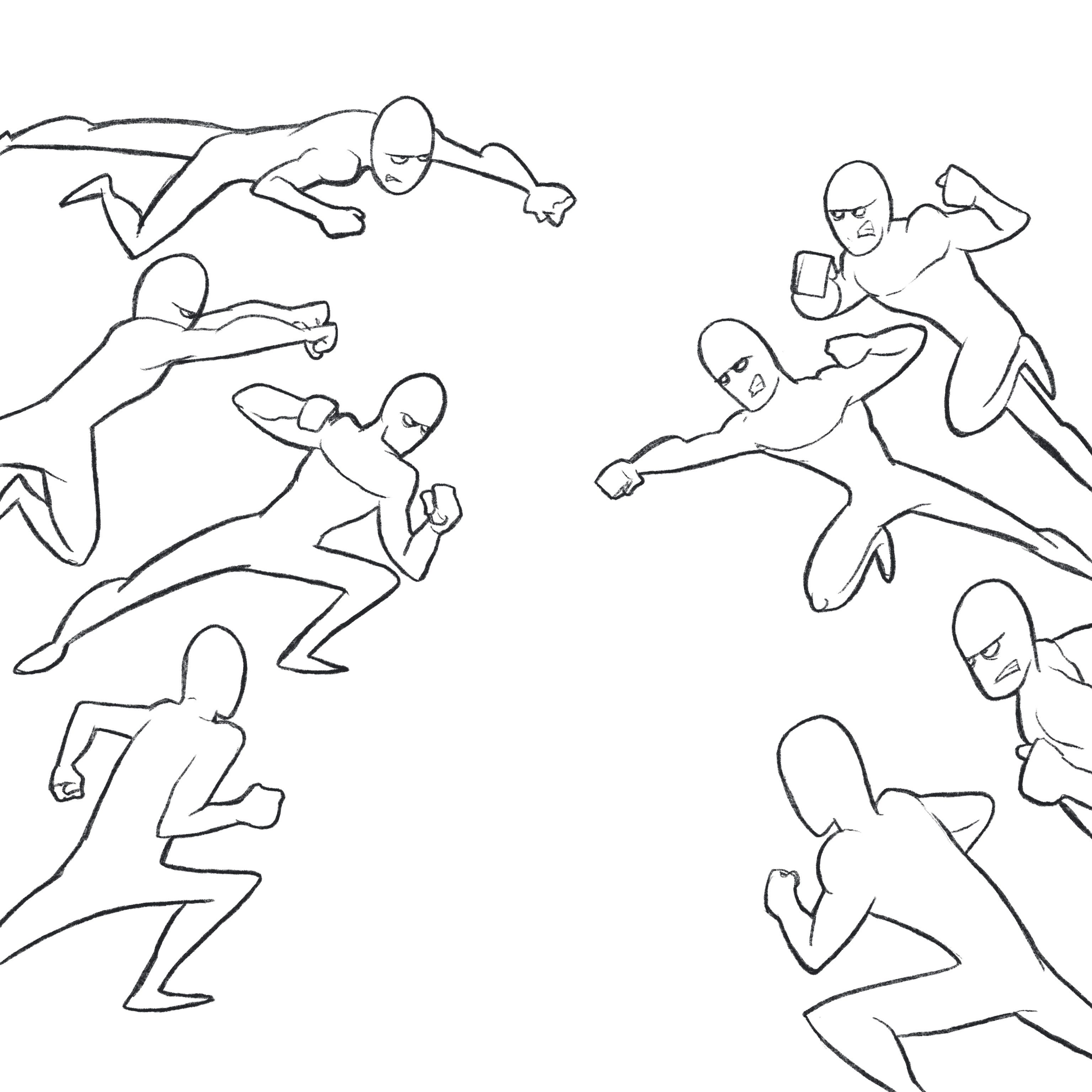
You see this a lot in super hero comics when the good guys are all lined up against the bad guys ready to fight. Without even knowing who the characters are, you instantly know that the characters in each side are related.
Continuity
I’ve written about this one before but the idea is that when there is a line that our eye can follow, whether it’s an actual line or a line of action or focal points, we will continue to follow that line to the end. This is a huge aspect of composing a scene as well as a coherent page layout. In comics, we’re just looking at a static image. We don’t have the same tricks that can be used in animation or movies, but using Continuity, we can achieve the same results.
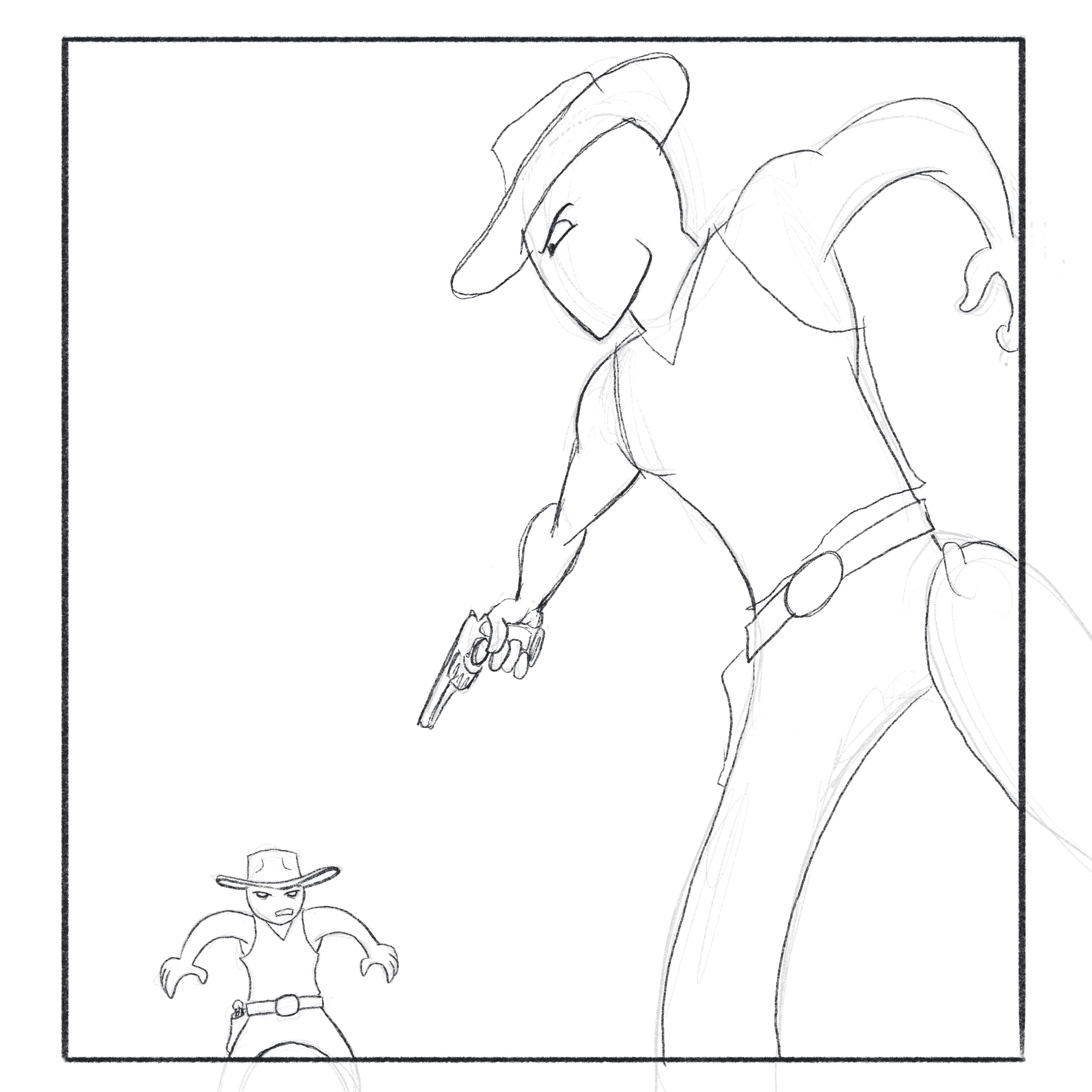
In this example, the larger (closer) character, who is the main focal point (more on that in a minute), is pointing his gun where your eye will naturally flow to next. This gives us movement in a static image.
Common Fate / Synchrony
Objects or figures that are perceived to be moving in the same direction will be viewed as related. Even if they’re farther apart or look different, their “common fate” will tie them together. This is one that can sometimes work against us if we’re not paying attention to it.
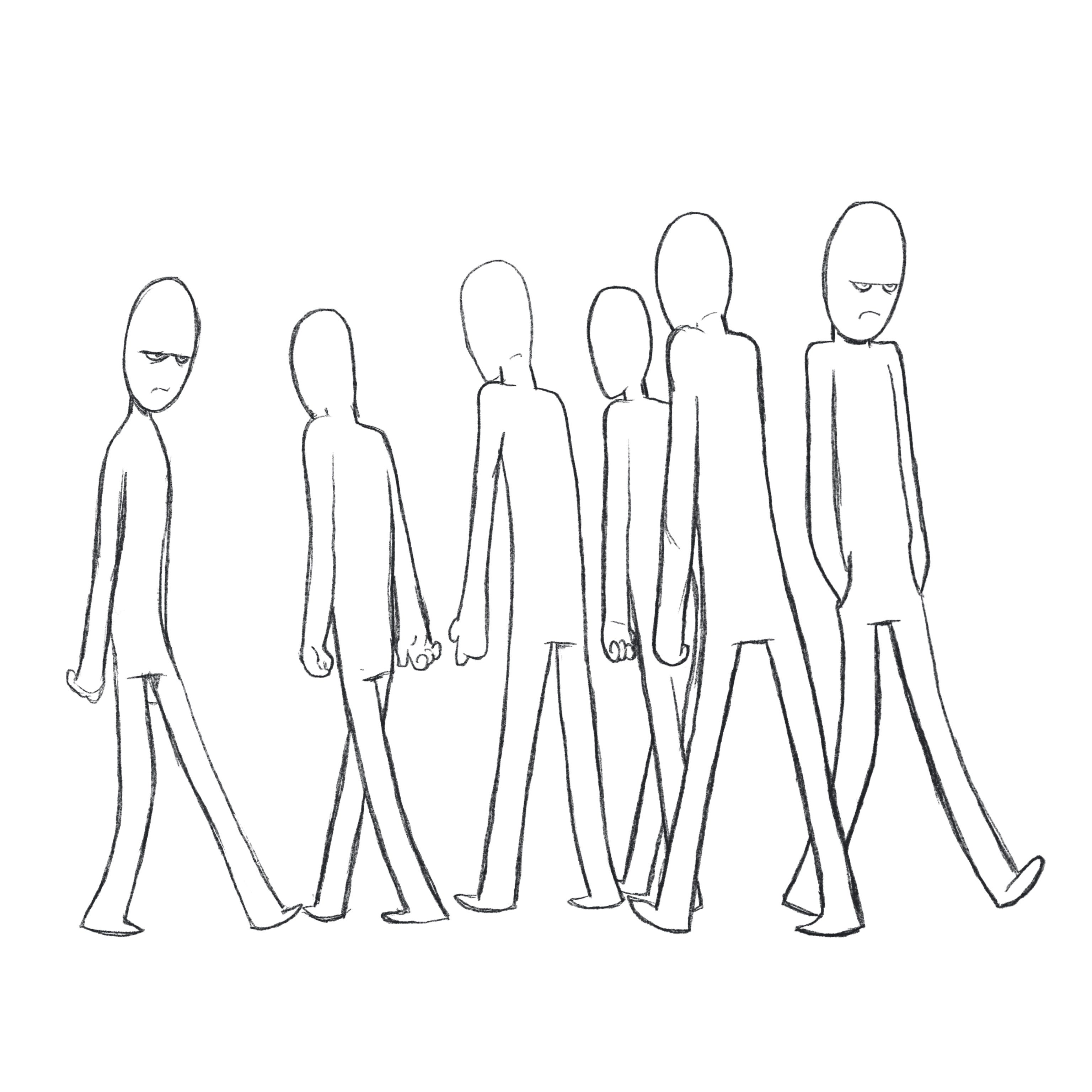
Here, the two chipper fellas walking in a crowd in the same direction have a common fate, at least temporarily, so our brain will consider them related.
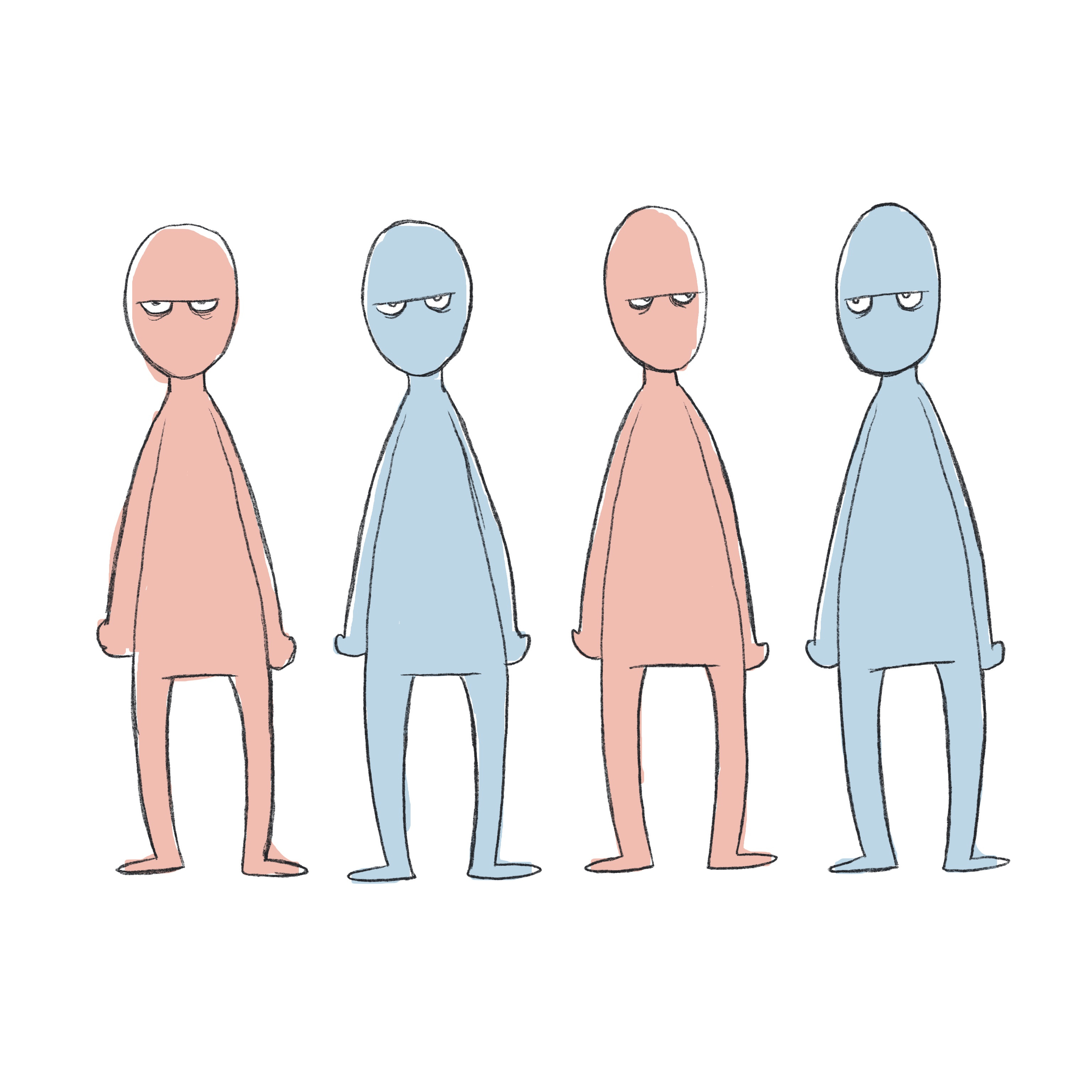
Similarity
When objects have similar characteristics, our brain will associate them together. There can be a hierarchy of characteristics, for example, if a bunch of shapes are the same size but some are circles and some are squares, then within the circles some are blue and some are red, etc. This one is fairly obvious as well but you can come up with creative ways to use this. For example, if you use warm colors on your villains and cool colors on your heroes, even before readers are told who is good and who is bad, it’s a subtle hint that can be a cool payoff later.
Focal Point
This is exactly what you would think it is. Every panel on every page needs a place where the reader is meant to look first. This is not always the most important thing going on in the panel but more of a starting point. The best compositions have depth, where the reader hits the focal point and then their eye is drawn in through other elements in the scene.

A common way to create an instant focal point is to break a part of the character or figure outside of the panel box. You instantly see that figure first.
Past Experiences
This one is a bit obscure because it is unique to the individual, but there are common experiences that we all (or at least the vast majority of us) share. Expectations about society or how things work. Color is often used to achieve this. For example, a big red button is often thought of as something potentially dangerous (launching or exploding something). How many movies, tv shows, or books have you seen or read that have a big ominous button that shouldn’t be pressed? Those past experiences set your expectations and help you understand a scene.

Wrap up
I hope you enjoyed this run through of design principles and how they can relate to comic storytelling. If you’ve never heard of these, I’m sure some of them probably felt like common sense, which they are. If they’re used correctly, readers don’t notice them, but they’ll have an easier time with your composition. Easy is good, when it comes to storytelling. The last thing you want is for your reader to struggle to get through a panel. It’s easy for us to overlook these principles or forget about them, though. I’ve found that when I get stuck on a tricky panel that I’m drawing or if something just feels off, going back and reading through these concepts can help spark some ideas. In a future article, I’ll get into compositions for pages and panels but these principles are the foundation for those ideas.
As always, thanks for reading and if you want to support me you can do that by buying something from my store - don’t forget to use the discount code SUBSTACK on digital items - or my old store which is still up until I get everything moved over. And you can follow me on Instagram, Twitter, and Facebook.
Have a great week!
-Brad